Writing from the glands of scientific theory

His griefs grieve on no universal bones, leaving no scars. He writes not of the heart but of the glands. -W. Faulkner

Recently, I’ve been quite busy working on a script narrative for a computer game that I’ve been working on for nearly 2 years now. It’s not the same game that I started out with. Indeed, I have had several major changes in direction, each turn became a personal revelation why the other idea just didn’t work for me.

One could look and say that I was fickle. Ultimately, I couldn’t concern myself with it whether it was true or not. For what is ‘fickle’ if only an external point of view used to categorise, and thus predict future behaviour? Why should I, of all people, predict my future behaviour?

One thing that I’ve learned is that the creative process is a process of thinking and feeling. Thinking and feeling bounce off each other and influence each other in kind. From thinking and feeling, we come upon that collection of intuitions that we may call instinct.

In writing, of which I know little about, I have been informed that there are types of writers who are plotters, and those that are pantsers. I’ve discovered that I’m a little of both.

In animation, of which I know much about, there are two animation methods called pose-to-pose, and straight-ahead. As an animator, I don’t work exclusively with one method over another. These methods are not techniques per se, but the only two ways of thinking about technique. Hence, as an animator, you are use both principles in order to find multifarious methods suited for the works that you want to do.

Whether you take concepts such as these strictly or loosely, the most important thing for the artist is knowing how and why these concepts are applied. I call this the Grey Area, because there is no right or wrong, only why something is working or not.

The Grey Area is like the Grey Matter — our brain — where any external concept floating out there in the world can plop down and relax. It is our little private room where we can do anything we want with these concepts, and no one has to know about them. Privacy is key, because privacy is what makes it special to oneself and potentially to the rest of your external world. As far as philosophy and analysis is concerned, I confine myself to these coarse principles of creativity. I’m happy to let ambiguous concepts mutate and evolve in the Grey Area.

Unfortunately, because of that loose creative disposition, I become irritated by over-analytical people. Out there abounds articles of a scientific bent which seek to ‘optimise audience-user engagement’ and ‘define and measure suspense (anxiety) in terms of durability’. Presumptuous titles adorn most of these presumptuous articles, and sometimes follow a template such as: “How Science is Helping Art…”, ‘Art’ being things brought on by the creative process, I would assume.

The life that gives breath to these articles is a superciliousness of these business-minded scribblers who use the authority of science to convince us of what they think the bottom line art is supposed to be. Go scrounge a few measurements, researches, testimonies, call it science if you will; but what was it that caused them to think that art was made to catalyze ‘unconscious involuntary responses‘, or ‘meet audience expectation’? If art had to exercise techniques in manipulation, and to some degree it has to, why does this seem like the overriding function of art? Why does a biological and psychological research into, say, the ‘fear-anxiety process’ infer that such stimulus must be pandered to at all?

The idea that science is serving the purposes of art is one of willful ignorance: even if scientific researches don’t objectively presume to understand or even define art, but only to observe its effects, why are the results of its conclusions always encourage ‘scientifically minded’ people to presume that artists need to act on these effects? Let’s be honest and perceive that science does not conduct its business to serve art. Instead, its very insistence seeks to bring itself above art by defining it, by saying, “I know you better than you know yourself. This is what you really need.”

And that’s the point when I say, no, I don’t. You can tell me what makes me cry in a movie, but you can’t tell me if I should be crying at all. You can push all my buttons to make me keep from pressing the stop button on this crappy movie for a few seconds longer, but you can’t tell me that it’s truly worthwhile watching. And if we, as artists, keep conversing in the thoughtless language of statistics and obsessive yet irrelevant analysis, pretty soon that’s all ‘Art’ is going to become

(If it isn’t already.)


Commercial: Tip Top Popsicle Smoothie

This one was a long, drawn-out schedule. In order to accommodate its numerically-challenged budget, it was thought that the schedule could be extended to several months so that we could put in other jobs in between this one. However, near the end of the schedule, we started picking it up again in earnest, and ended ironically with a quick tempo. Over-extended jobs like these invariably turn out to be rush jobs in the end. This wasn’t the case of procrastination, but the limiting of hours that could be spent on it. Consequently, we were set to do other jobs, and in the end, it could be argued that we had to spend more time on it due to the inefficiency of going back-and-forth different things.

My contribution to this ad was that I helped think out the render strategy, helped the render layer setups, modelled the base of the blender (yay!), troubleshooted character models as it relates to the rig, did the white mist effect using Maya fluids, did a breaking ice simulation that replaced by another simulation, helped shade a few of the elements, and assisted in the initial comping.

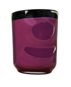
The render strategy was thought out early; we saw the character design as a final art for a poster, and Terry and I worked out the booby-traps in making this character work in 3d. It all boiled down to the refractive properties of the characters especially around the cavities (eg eyes, mouth). If modelled literally, the character would look wrong (and slightly horrific) in many angles, since the glass would refract the dark cavities.

The solution was to make render the glass as though the smoothie content was unbroken by the mouth or eye cavities. This way, the refraction was as seamless as possible.main_v010_BTY_blenderGlass.0039Then, it was a simple matter of comping, using masks, the mouth cavity and eyes, and the rest of the limbs.
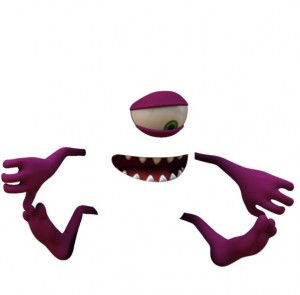
main_v010_BTY_blenderBodyParts.0039


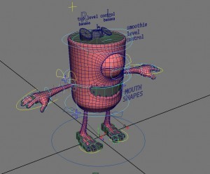
Apart from my usual responsibilities maintaining scene integrity throughout the whole project, one of my other main contribution, was rigging the characters, which I used AdvancedSkeleton with. The rig went through a lot of iterations in its cycle, mainly to do with consideration of the render elements that changed as we moved forward. Towards the end, collision objects were added into the rig to affect the ice that broke apart around the characters.

Because these two characters were identically in many respects, yet had considerable differences, too, I opted to create a generic rig was which featured elements from both characters. The most notable feature are the fruits sitting on top of the characters. A simple boolean switch handled the switch between the ‘pink’ and ‘purple’ characters.

In keeping with Sandline workflow the rigs had to be uniquely named, so I wrote a simple variant export. When a rig change had to be made, the generic rig was modified, and the variant export was done.

One of the workflow strategies we developed in the Mother Earth Pingos ad was using rigging low-resolution meshes into lattices in the rig itself, whose lattice points would be exported as vertex animation. Then we use the same lattice setup in the models file, and put the high-resolution meshes there. This is the approach we used for controlling the high-resolution fruit meshes on top of the character (though, on reflection, a lower resolution would have sufficed).

2016-02-10 12_40_21-Autodesk Maya 2015_ r__3d_2015_07_TipTop_Popsicle_Smoothie_3d_scenes_rigs_PINK_r


Commercial: Spark Digital

spark_digital_thumb_2
(Click to watch video)

This was a crazy one, though a bit hard to explain how. If you find that above commercial is somewhat stylistically schizophrenic, then that goes some way in not having to explain a whole lot more. Like many of the works I do, it’s hard to claim substantial ownership, hence the sometimes-lengthy commentary.

I contributed a few sequences to this ad: the hacker-chess-armour-snow globe sequence that starts with Julian Stokoe‘s illustration of the hacker with a computer I put in there. I also did the pinball animation sequence before that.

Another good reason to break down some of my works is that I, myself, take my own work for granted. Before I reviewed the clip, I recalled that the pinball animation was my only contribution. Sure, this reflects the hectic day-to-day work, and my pathetic memory, but it underlines the need to give credit where it is due; less about outward or social recognition, but a true appreciation of what tends to be forgotten or ignored, even by me.


Series: The One Winged Bee Called Emily

Only one episode of this aborted series seems to be out on the Internet, which is the video you see above. In fact, three episodes were commissioned and finished; the two other episodes are lurking in someone’s hard drive, and although I could get a copy of it, I don’t think I’m legally authorised to upload it, regretfully.

All of the character animation in those three episodes were done by Brett Tunnicliff, save the titles, which I had done. Terry and I had been responsible for modelling and texturing the characters. I rigged, rendered, composited, and cut the the episodes myself. The direction of the first 2 episodes was headed by the boss. But by the third, its future prospects for its continuation waned — as did interest in it — and I was given the honour of finishing off the series oddment as a quasi-director.

Predicatably, the third was my favourite as I felt a bit freer to experiment; no one really cared enough to put their 2 cents into it by this time. So I tightened the storyboard to make the cuts fit in better, and began with a beauty pass timing animatic that I would get sign-off from the boss, and things proceeded smoothly from there. Brett commented that he particularly enjoyed the flow of the third episode, which is a nice thing to hear, as I enjoyed running my own small project.

No one would probably see that work, unfortunately. And sure, the end result might look dodgy to some, but to remember one of the reasons why I post these things: many jobs come with disadvantageous circumstances that affect the outcome, but if people knew just how much work was put in, they’d know it would have been a surprise anything came out of it at all. Most people appreciate only just the bells and whistles, or the polished gold trims, but I’m here saying that there is a hidden engine that powers all creative endeavours that should be recognised on equal footing.

Iteration

Iteration is the creative process of improving the work in incremental steps. I don’t know if it’s truly a buzzword, but from where I’m standing, it’s always buzzing around. But I think that iteration means something different depending on where you’re standing.

In an advertising agency, for example, the creative team goes through their own rounds of iteration, brainstorming ideas, solidifying them visually through thumbs for internal meetings, then a concept board (if it’s a TVC) to be cleared with client, then upon feedback, work the process up to a storyboard. The creative process is completely internal in that they have full control over their workflow with the client giving feedback. Ask the creative director what iteration means for her workflow, and she’ll tell you “it’s working up the Idea in small steps, making sure, all the while, the client is kept in the loop and making appropriate feedback, which we then apply, and advance the Idea into a final storyboard to be produced.” So far, so good.

In the post-production shop, the process is pretty much the same, only a bit more complex, naturally; we deal with lots of technical elements. So while an agency might have a single pipeline we have at last four going almost concurrently, and those pipelines intermingle with each other. We have models to be made, rigging to be applied to models, animation to be applied to the rig, models to be shaded, shaded models to be lit, whole scenes to render, renders to be comped, effects to be designed and comped, etc. And that’s a standard bread-and-butter job. Let’s not get into things like simulations, matchmoving, rotoscoping, and the like.

Now imagine the same creative director is working with a post-production shop to produce the TVC. Ask the same question, “What is iteration?” She’ll answer, non-verbatim, with this expectation: “I want to see the final product very soon, and iterate that until it becomes better.”

Because the post-production process is unknown to her, she doesn’t realise that we have many final ‘products’ to iterate over: models have their own iteration-cycle, distinct from the animation iteration-cycle; so is look development, so is effects development; and these come together as a ‘master’ development pipeline with a separate iteration-cycle as well. She doesn’t automatically think to apply her own iterative workflow principle to the post-production side because they are uninformed. But because they prefer not to know, they remain at arm’s length from the post-production group, as distanced as they themselves, as creative teams, are to their clients, who are equally indifferent of their process. The indifference is passed down from client to agency, from agency to post-production, generally speaking.

Now, all this time, I’ve been using the agency’s creative director as my example. This is not a fair emphasis, by the way, though it surely makes the point clear, and many agencies relate this way to post-production houses. But you will also find directors, be it art directors, TVC directors, or anyone calling the ‘creative shots’ are just as guilty of this indifference. But the worse of all, it should be noted, is that the indifference occurs within a post-production group, as some of the upper crust only pay lip-service to the very technical nature of their own operation. Though I began with the ignorance of an agency creative director, she is the least guilty of them all.

The post-production upper crust might have done well to learn the internal creative process of the agency. But I think they condescended to think they could be anything but the client, and thus distancing themselves from their own post-production group. Perhaps by assuming the superior client role, they thought can eke something creative out of the ‘headphone-hooded geeks’.

The agency enjoys a creative process that they themselves have built and enforce in order to serve their own purposes because doing so will yield a better product for the client and for themselves. Yet, the post-production group gets served up onto a plate of uninformed demands by uninformed folks, left undefended by the upper crust who are just as uninformed; and it would have yielded poor results if not for talent and lots unnecessary personal sacrifices. But even sacrifices have their limits.

Anyone who demands, “I want you to go hard out so you can get me the final product tomorrow, so I can iterate/nitpick/pixel-fuck that until it becomes better” does not know what iteration means and lacks the discipline of imagination necessary to mix the creative aesthetic with the highly technical processes, which is what this industry is about.


Commercial: Orcon’s Daisty and Gav (Go Unlimited)

I consider myself a competent but frustrated character animator. I say frustrated on account of people’s bias of me as a technical person, I’ve too often been asked, instead, to rig characters. In this case, the characters of this commercial were completely in 2D, illustrated by Gareth Jensen, who also did a lot of the animation along with a few other animators.

The main difference was that the job was going to be done completely in After Effects, including the rigging. I’m not an AE rigger, nor have I animated a character in AE before. While I’ve seen what mind-boggling AE rigging tools can do, at the time of this commercial, I hadn’t seen any of them yet. So I basically had to do everything from scratch: learn Puppet Tools, create the workflow for swapping assets, expressions to switch drawings, etc.

Frankly, I don’t know if I want to do that again, given the powerful rigging tools available today. I think I’d prefer to animate.

Commercial: Little Red Bear (Gau Yeu)

I worked on this as a freelancer, and it was quite a frantic job. There were so many elements and if a cg forensic psychologist would examine the Maya scenes, they would find that loads of textual clues of how stressful this commercial was.

For all its unbearably fast pace editing and doubtful composition choices, the final renders didn’t look half-bad at all. Of course, I must say that I didn’t contribute to the rendering. :)

My contribution, in fact, was, again, the rigging of the characters; they were actually flat characters (to depict a 2d look), and I rigged them accordingly, which was a crazy thing, actually. I didn’t have a say in the matter, of course. The red bear protagonist was only partly 2d: he had some thickness.

I got a chance to animate some of the characters, like the villainous evil purple guy and the spectators on the stand. But, once again, in the spirit of this thread, to make known what is normally hidden away from the those who view this, my contribution extended far beyond what was nominally given to me. For most of the time, character animation (not limited to this job, of course) had been revised by me, though I couldn’t take credit for it officially because I hadn’t originally been assigned to do it, nor could say it had been mine unless I nixed the original completely, which hardly ever happens. It happens not only in animation, but in every aspect of the job: shading, modelling, rendering, setup, rigging, and even compositing.

Perhaps that’s why it feels much bigger in my mind than what the credits say: to have personally struggled against a stubborn scene that was placed on my lap, and thus produce the grain that otherwise wouldn’t have been produced, impresses upon me the importance of looking beyond the obvious.