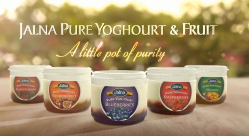
The cg aspect to this — falling blueberries on yoghurt in a pot — was another solo job for me. The final comp was a Flame job, though I always try to get 3d renders as close to the actual colours as possible.
There was no pre-production for me as this was just given to me all of a sudden; I would have liked to have gotten lighting information in the set and reference plates. Basically, what we had — not a whole lot — was all that I could work on. Thankfully, there was a close-up shot of the pot as part of the edit, which I used as projected texture back to my cg pot model. This allowed me to get graded colours directly onto the 3d render.
The viscous yoghurt fluid sim was done in Realflow, and rendered in V-Ray because the sub-surface shading there was very easy to get. But the rest of the elements were rendered in LightWave where I could get the most control over how colours were being rendered. This was important because I had also taken a piece of reference footage which showed how the pot looked like under a lighting condition similar to that of the cut. LightWave’s nodal shading system made it easier for me to control the shading of local areas.
In most jobs, I’m glad to be working in the shadows. There are some jobs that I’m really glad to be in the shadows. This is one of them.
Let me be clear: when I say I’m glad to be in the shadows, I don’t mean not being associated with the ad; I’m perfectly fine with the final product (not to say I particularly like it — I’m just fine with it). What I mean about shadows is this: it’s like being inside a tank while looking at a huge industrial fan and above it, tonnes of horse shit ready to drop onto it. When I see trouble, I try to warn off the people. If people don’t listen, I take cover myself.
And remember that this work thread is not just about what you see, but about invisible things behind the work you see. And in this case, what was behind was quite incredible from a production point of view. And I don’t mean incredible in a good way. But let me only say one thing among many things:
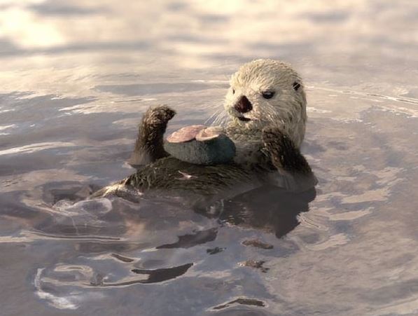
We didn’t have the render hardware and software to render Yeti fur, and that we had to sink lots of money to subcontract our rendering; first in the messianic illusion that is cloud-rendering, and second, when that failed to save, in an old-school outsourcing rendering service. The good news is that after two years of waiting (the job was 2 years ago) we have finally incrementally upgraded our software and hardware. There, I wasn’t being that negative was I? Less is definitely more: when you have shit hardware you have to rely on your smarts to get things done. So I’m not choked up about hardware because it helps me shine!
Speaking of shine, there are those that brought the goods on this project. Louis Desrochers groomed the Yeti fur look, and we devised a way to generate wet maps from Maya, since the our Realflow op couldn’t get wet maps from Hybrido sims at the time. We used a combination of ambient occlusion maps that have an Time Echo effect applied in After Affects; that image sequence drove the Yeti maps; I was the one that wrote the script to bake animated ambient occlusion maps to be plugged into AE.
There were so many other people involved in this project, and contributed their part in it: I didn’t even get to rig the otter! That’s a first! Of course, as usual, I was there to clean up the scenes and troubleshooting the most stubborn of the lot. But when the dust finally settled all I wanted to do is forget about it.
This is a 3-part ad that ran on digital posters. The concept of the ad was simply to use the Japanese origami style of folding. Terry and I worked on this series, with him doing the first two (left and middle), and me doing the third. Terry consolidated all the shading in V-Ray, so that once the rig or animation was complete, they will all, more or less, render the same.
The rigging was, of course, the most complicated bit, along with cutting up the geometry to make it appear to fold. especially in the section I was working on, as it featured lots of round corners, pipe rails, etc. I found it difficult to translate a generator of the design the client wanted to fold like paper. In the end, I wonder if it looked more like a Transformer animation than folding paper.