Janus for Mac

It’s a bit too early to shout out, so I’m whispering here in my little blog about Janus for Mac. I’ve restarted development for the Mac. It basically just took a weekend to hunker down and sort what was going with it.

The biggest issue that I came up with was the use of LScript’s store() and recall() functions, where in Windows it uses the registry to store the information. In the Mac, I’m not sure where it ends up, but apparently, calling it those functions multiple times seemed to put LW in a state where it could no longer stream more files into memory. It was as if the i/o was full.

I avoided this by redirecting the functions; this was already facilitated by the fact that they were already housed in custom functions, and all I had to do was make it everything cohesive. I also cleaned up the code so that the array that Janus uses to store settings were more consistent, and that the PC version should remain unaffected by the change.

At this point the Mac seems to be very workable, and I’m probably going to do a few iterations of tests in the coming weeks. And who knows? — it may come out officially soon after that.

The tool is not the thing

Tools, and I mean software tools for 3D, continue to change, and they’re very impressive indeed: yet another toolset, this time for texture artists. There are already impressive ones in the killing fields and there is bound to be more; it is bound that these will continue to improve. Perhaps you can relate to this sentiment: you can never have enough of new software capabilities.

I find myself, like many others, being at awe with the amazing technologies that come out. It’s like this never-ending creation and re-creation of stuff. Industry lessons are learned, and these new methodologies are passed on to these new tools. And they will always impress. That’s because they will always be geared towards solving today’s so-called problems.

But what are those problems, really? I would like to point out that they are essentially technical problems. Technical problems birthed by past technical problems that were solved. “Now you can do this” is the cyclic tagline of many a software product.

I’d like to phrase the problem this way: Imagine yourself imagining your work. This is the impression I have when I see new software, or improvements to it. I get so enamoured by the capabilities of the software that I imagine what I can do if I had it. And that, to me, is part an advantage, but largely a curse. It is an advantage to those who can tune it out, because they’ll reap the benefits minus the curse. And the curse is, I think, that we can never sit still enough to ignore the fanfare and get on with it.

I am putting this in the context of a creative artist, not a production artist. In a production, in an industry, the creativity lies in many nooks and corners, dark hallways, or wide-open spaces – depending on the  group you work with. But as a rule, tools are meant for streamlining methods, making people or systems more efficient. But not everything that is efficient for production is efficient creatively. Whatever efficiency can be gained by an individual artist adopting a new tool every other month or so must be weighed against the distraction of a new feature that he or she has just got to have so the artist can achieve the look that wasn’t sought for before it came around.

Lastly, I’d like to add that, at some significant point, we become more creative by limiting our tools. And I quote Bruce Lee: “It’s not the daily increase but daily decrease. Hack away at the unessential.”

In modern-speak: Cut shit out.

Refining the definition of voice

I went one of the local libraries the other day with the intent of spending my morning there reading, and the rest of the afternoon drawing. As I moved closer to the book shelves, for one reason or another, I remained in the graphic novels area – a general genre of books that I have very little interest in. I still like some comic books: Asterix, Calvin & Hobbes, Far Side, Peanuts, TinTin, B.C., etc; I grew up with these. Thanks to my brother I was exposed to more serious minded comics like The Light and Darkness War, whose style and tone was, to a young teenager, something like a wide awakening – a baptism of imagination, if you’d like.  The panels were watercoloured, the lines were thick-thin, and the prose was poetic enough for me at the time to appreciate the authors’ collaborative voice.

I took some of this with me in my days in a fine arts college – my course was actually more oriented to graphic arts – and cultivated the inspiration as much as an under-achieving art student could. But diving into the labour force after college essentially marked the end of my adventures with serious graphic novels: comics which portray violence – often extreme – and gore, sex and explicit language. My foray into computer graphics turned my attention away from drawn stories.

It was only recently that, after longing to re-imagine myself and reassess my goals, I wanted to go back to basics and start drawing in earnest again, after ten years of professional CG work. And that’s where I found myself in front of the graphic novels area staring at a copy of DMZ. It featured mercenaries, and it described a dystopian landscape – I sneered on finding out that the story was set in NYC. NYC is over-mentioned, you see: ’nuff said.

I read the whole book. And despite the clumsiness of lines, the inexpert  description of form, and even the cliche of its language, I appreciated it mainly because it touched on subjects that I had swirling in my brain: guns-for-hire and wastelands of worlds. When I had finished I put it back on the shelf.

I wasn’t satisified: I wanted another to feed my mind. I laid eyes on one book. I wasn’t fully interested in the cover, so I scanned the shelf a bit more. I spent five minutes flipping through pages, then my eyes passed on the book again. I thought, “Hey, look, there’s a tired-looking Afghan with an AK47”. So, on account of sighting an AK47 I picked up The Photographer and started the story that would prove to be the closest thing to a second awakening.

The book is not a miraculous work. It’s not the most outstanding piece of literature I’ve read: I’ve been impacted more by other books, far deeper, and far longer. But this, being a graphic novel, it impacted me far more than any graphic novel I’ve flipped across.

As I read, it felt it difficult not to compare it with the recently-read DMZ. I became acutely aware of how dissatisfied I was with the other book, and how much more refined and expertly Emmanuel Guibert, the illustrator and visual director of The Photographer, had drawn, and – more surprisingly – had written the story of Didier Lefèvre. He had interspersed his comics with Didier’s photographs as he told of Didier’s travels to Afghanistan. Because the illustrations realistically depict people in a simplified (read: masterfully economical) style, the black-and-white photographs jolt you to the palpable sense that the story is really non-fiction. It doesn’t just fill in the blanks between the discrepancy that a photo-essay’s pictorial gaps suggests; it puts in a much more lucid level of storytelling.

Despite the fact that the subject matter was about doctors and a photographer, and that the only shot fired in anger was from an “asshole ‘muj'”, The Photographer thoroughly impressed, and more importantly, inspired me. In the CG field there is so much emphasis on detail, which involves real-world fidelity be it in photographic, or otherwise just physical terms. If it isn’t that, then it’s about resolving our work methods to conform to some pipeline: yet another detail to abide by. But within The Photographer, I found none of that. In the first place, the illustrations were minimalist, and yet I found excellent form posture, action, and human expression; detail was only necessary when it was necessary. In the second, the photographs were not used because they were photographic in quality, but because they, as photographs, told their part of the story. In the third place, the style of telling was uniquely individual: it wasn’t like one of those monthly high-profile, run-of-the-mill animated-feature-films (where almost every animated character motions with his hands and eyebrows the same (freakin’) way). The writing was powerful, brutally honest: honest enough that in two parts in the story it made me sad enough to tear up. A comic book has never had that effect, and I never thought it could have.

The Photographer’s impact on me as a reader and as an artist has caused me to re-evaluate what I am really about as a creative person. I would like to think I was a real artist, but I know that I am just a mercenary CG man with good artisan and technical skills. I’m not sure how much of being a professional contributes to creativity, but I can say that this book has forced me to confront the numerous habits and rules I have adopted as a professional. It is easy enough to say to think outside the square, than to realise that you are the square.
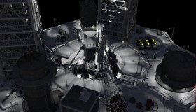
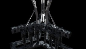
Rocketship: Launch Platform

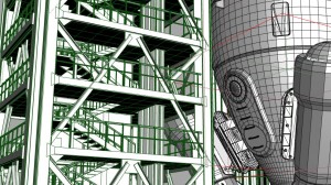
The launch platform is slowly getting more elements in. I’m finding it a bit tedious, though it’s helped by some of the railing tools I’ve done.

The lighting is obviously a temporary thing – more of a hint than anything. The ‘tri-beam support’ is situated under the rocketship and is partially hidden by the platform structure. The picture below shows it by itself as a unit.


The platform, in general, has received smaller structures as well as some semi-completed buildings, which will be refined on a shot-to-shot basis if need be. Some camera movements have already been laid out, but there’s a lot of considerations still.

Tools

In the course of building the launch pad for my rocketship, I have built two very simple tools in Houdini, which are called HDA (Houdini Digital Asset). One creates simple straight ones that have options how high, how long, and the thicknesses of the top bar and middle bar, and how many vertical bars in the breadth of a metre. The other creates railings that follow the shape of a curve such as those found in staircases. These tools have been an immense help in laying down geometry quickly, and to control as many aspects of the object as I want.

While I find Houdini’s basic functions to be relatively awkward compared to more sophisticated modelling apps like LightWave or Maya, its true procedural workflow is such a mind-blowing tool in itself. Granted that it does take more time to do simple stuff, the benefits of making mass revisions on highly detailed meshes is easy-peasy. For example, the image pictured above includes one of my launch towers. Based on how I’ve set it up procedurally, I can not only specify how many floors I want on-the-fly, but I can just as easily change the height of each floor, and that, in turn, changes the geometry of the stairs to accommodate for the adjustment. If I had to do such adjustments in Maya or LightWave, it would be a rather tedious job, especially if I’ve made critical modelling choices beforehand, which usually happens anyway.

I think, overall, the significant thing about Houdini is that I’m having loads of fun again which I never had when I was learning Maya. I had fun learning LightWave and it was always a friendly package to use both as a hobby and professionally, but it has been increasingly a frustration as time goes on. I do wish that I could slow down a bit and start learning more about the tools and writing some Python in Houdini, but I do have a commitment; I have been turning my head away from tool-making tutorials and avoiding complex solutions. But hopefully, when this short is done, I can start delving into some of the workflow issues that have come up. I already have a list of tools I want to create.

Houdini: Rocketship

About three weeks ago, I started learning Houdini. Such a long time coming. I remember, back in 1997, just before I started learning LightWave, I saw Houdini included in some CD ‘collection’; I can’t remember the version back then. I fired it up, but my trusty Pentium 133 ‘workstation’ was not able to cope. I left it at that, and in retrospect, I suppose that I probably would not have picked up 3D had I persisted in Houdini. I wouldn’t have understood it.

Fourteen years down the line, more than ten years later working in the CG industry, I seem to have gone back to that period of re-discovering Houdini. In the course of my CG life, I have learned to fit in the role of TD, and through a vast amount of trial-and-error I have learned to think procedurally. I wanted to learn Houdini because it supposed to coincide with it.

However, I didn’t want to learn Houdini for the sake of its much-advertised effects features. I wanted to learn it like every other application I’ve learned: holistically. I wanted to model, shade/texture, light, rig, animate, sim, and render in it. I want to be confident in the whole spectrum in Houdini. As I was pondering this, I remembered my first ever LightWave short called Old Rocketship, which I did in 1999 for three months. I did it while I was working for a non-CG company; I was frustrated and wanted to leave to find work in CG field. So the story is just about a ‘rocketman’ riding his rocketship out to the moon, and on the moon, he opens up a mailbox (?) and there he pulls out a piece of paper with a writing saying, “Have you done tried to leave yet?”

Yeah, I know, it’s weird, and the original edit was over five minutes long. But this sparked in me some old love. I decided that I was going to learn Houdini by re-creating this short. It would be like when I first picked up LightWave; now it would be Houdini, and I’ll improve upon it. But I also decided, just like back in 1999, to work within some time constraints. I would have to haul ass, because I would only give myself a maximum of three months to do this, with or without other professional obligations.

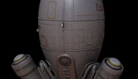
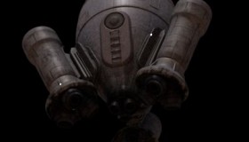
As of this date, I’ve finalised most of the rocketship (which is posted below), except that it’s not rigged yet. The rocketman’s design is still a WIP (sketches), and there is still the launch platform, the environment, and the rocket blast effects that needs to be considered.

Freelance

It’s been quiet here mainly because I’ve been busy with freelance work.

I recently concluded a gig as a rigging TD over at Huhu Studios; that was for about a couple of weeks. It was a good place, though a tad bit quiet and people generally keeping to themselves. It was good to see some familiar faces, however; there were a good number of folks there that were my former students, and they were always great to be around with. It’s good to see them working, too.

More recently, I’m working for a post-production outfit called Toybox working as a generalist on some commercials. Very cool and professional people; I like the atmosphere a lot and the pace is a bit more my liking: always on-the-go. But living up in Snells Beach is a bit of a bother; I get by car-pooling with a friend who actually works in another CG facility across the street. If my gigs get more regular in Auckland, it may be time to consider moving down, I suppose.

I’ve also been working on Janus ever since I managed to make it work for the Mac. Funny thing is, I’ve been trying to get Janus to play nicely with the Mac ever since I released the product. It was only because I had to optimise the Janus GUI recently that I had revived my hope for running on the Mac, having suspected a heavily-laden GUI to be the source of the trouble in the first place. But at that time, I couldn’t be bothered to revamp the GUI because Janus had other issues to contend with.

Just before I got busy with Janus, I completed development (for final release) a LightWave to After Effects utility, which was commissioned by a fellow professional LightWaver who is based in Malaysia. LW2AE, as it is called, is not yet released, but I’m hoping to suss that out when I release Janus for the Mac.

Despite being in the middle of all this, I hope to get one ongoing personal project out of standby-mode soon.

Kitchen / Dining Room Indoor Morning (WIP)

Recreating a real-life scene (WIP)

I seem to have a lot of WIPs and no final renders, eh? Hmm….

At any rate, this is the product of a ‘great’ idea to recreate something from a photograph which I took. I can’t show you the photograph in interest for national security (e.g. my wife will not stand for it). And sometimes, a pristine CG depiction is all people need to see. Needless to say, this WIP needs several more iterations. Due to the suckiness of mental ray render times, this project will be finalised in several stills (or maybe just one – heh).

(Everything I’ve been doing since DBX’s forest scene has been in linearised colourspace. I’ve been shooting pictures ever since I was a teenager, and now that FP has come around to CG, I’ve been able to relate exposures in photographic terms back into CG; gauging intensities in the real-world, I try to mimic those in the FP-world.)

Corner and Avenue Lighting Scene (WIP)

So, I recently was working on indoor scene that wasn’t that much fun at all (will post it up later).

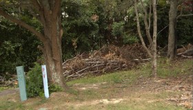
I got myself an itch, went under the open air, rubbed my chin about the corner, and took a picture there and there.

Took the original picture in RAW, colour-graded it in 16-bit, while taking off blocks of cement out. I knew I wanted to relight this scene, so I carefully modelled the lightcatchers: the two nearest trees and the ground.

Originally I wanted this for an integration piece, but now, as a re-lit the scene with a strong sunset light, I’m thinking that I can do a very fantastical scene with butterflies, flowers, and all that kind of crap. Ha!