
I find it odd looking at a movie poster of this. I think we were the sub-sub-contractor, and we practically did one sequence from this movie: the escape to the helicopter scene, where we created the dust effects.
Now where’s my award?
I find it odd looking at a movie poster of this. I think we were the sub-sub-contractor, and we practically did one sequence from this movie: the escape to the helicopter scene, where we created the dust effects.
Now where’s my award?
Ok, this came out of the blue, and while I couldn’t have cared any less for this referendum on the NZ flag, here it was, on my lap.
Was given a day to do it, and did it I did. The production client loved it — why not? it’s a laser kiwi! — and off it went.
I really wish I had more stuff like this come my way.
This is one of those many commercials that I do that best serve as an example of why I started to post these works up. I’ll explain. This commercial is Mother Earth – Pingos, and if we go by the usual way we credit these sorts of works in the commercials industry, I would be considered as having nothing to do with the project whatsoever. The animatic was done by the animation director, and from there everything else was was done by Terry. The main character was primarily animated by Paul working as a contractor. Terry set up, lit, shaded, and rendered all this in V-Ray, and then comped it up as well.
My part was a thing called Sandline, our budding shot/cache automation system, which has grown much since then. It wasn’t me who operated it, however; it was just me who’s developing it. Sandline is one of those things that helped Terry along the way; conversely, Terry helped refine Sandline as well by spotting workflow issues as it related to this job.
Oh, I lied; I just remembered I did actually do something in the ad: I did the cool looking ribbon logo animation at the end. There! Can I have my award now?
There are some jobs that I have contributed a very minor part. And sometimes even those minor parts were eventually culled from the final work, as was the case with this job. One invisible contribution I had was the procedural light bulb animation at the beginning, and the rigging of the multi-legged robot.
Again, jobs like these are exactly the reason why I’m putting them up. Sometimes, you need to say you were there, you worked, and you participated.
In most jobs, I’m glad to be working in the shadows. There are some jobs that I’m really glad to be in the shadows. This is one of them.
Let me be clear: when I say I’m glad to be in the shadows, I don’t mean not being associated with the ad; I’m perfectly fine with the final product (not to say I particularly like it — I’m just fine with it). What I mean about shadows is this: it’s like being inside a tank while looking at a huge industrial fan and above it, tonnes of horse shit ready to drop onto it. When I see trouble, I try to warn off the people. If people don’t listen, I take cover myself.
And remember that this work thread is not just about what you see, but about invisible things behind the work you see. And in this case, what was behind was quite incredible from a production point of view. And I don’t mean incredible in a good way. But let me only say one thing among many things:
We didn’t have the render hardware and software to render Yeti fur, and that we had to sink lots of money to subcontract our rendering; first in the messianic illusion that is cloud-rendering, and second, when that failed to save, in an old-school outsourcing rendering service. The good news is that after two years of waiting (the job was 2 years ago) we have finally incrementally upgraded our software and hardware. There, I wasn’t being that negative was I? Less is definitely more: when you have shit hardware you have to rely on your smarts to get things done. So I’m not choked up about hardware because it helps me shine!
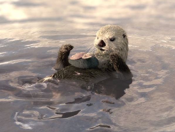
Speaking of shine, there are those that brought the goods on this project. Louis Desrochers groomed the Yeti fur look, and we devised a way to generate wet maps from Maya, since the our Realflow op couldn’t get wet maps from Hybrido sims at the time. We used a combination of ambient occlusion maps that have an Time Echo effect applied in After Affects; that image sequence drove the Yeti maps; I was the one that wrote the script to bake animated ambient occlusion maps to be plugged into AE.
There were so many other people involved in this project, and contributed their part in it: I didn’t even get to rig the otter! That’s a first! Of course, as usual, I was there to clean up the scenes and troubleshooting the most stubborn of the lot. But when the dust finally settled all I wanted to do is forget about it.
My contribution to this ad is typical of my usual: bits and pieces everywhere, not claiming to a whole lot, and yet stuck on to it like bees in a hive (funny metaphor methinks).
I took HDRs during the shoot and assisted in the vfx supervision. Meanwhile, back in the studio, to the advice of Will Brand, we had laser-scanned reference shells and Terry was busy cleaning them up. Afterwards, I rigged the crab as other work continued on it.
I tracked and set-up most (if not all — can’t really remember) the shots, including the base lighting found in the HDRs. I had only one scene on my name, but, inevitably, at the tail-end of the commercial, when the producer started ending the contractors’ terms, Terry and I were left to fix up the needed bits for the Flame op.
That sort of arrangement is often the case with jobs that require a number of people; as the quasi-core group, a lot of the heavy lifting goes to the contractors who are hired especially for that; when the bulk of the work is done, whatever other technical issues that require sorting often comes down to us, because by that time, the producer has decided it’s costing too much to have contractors hang on (oftentimes I think the reason is that the producer has hired too many guns to begin with). And that’s why it sometimes feels like we’re clean-up men.
About a year ago, a client connected with Toyota requested a bid from the company. Part of that request was a edited compilation of the commercial style they were looking for. It was slick; fast-moving, lots of stylised cinematography. We didn’t get it, and for reasons I never usually know. Yet, it was no surprise; nothing in our company reel resembled anything like it.
I thought — it was not a new idea for me — why not take some cuts from the compilation, and recreate it in 3d or something? The simple thought was that at the end of it, new slick material can be put on the reel. I attempted to do this by creating the road forest scene you see above; this was based on one of the scenes in the compilation, though I had put in more detail and brightened things up a bit.
To be honest, this piece is half-baked, as I was soon overrun with other work and didn’t bother to revisit it, mainly because no one else in the company was interested in making new in-house material.
The song is by Graham Hadfield, whose Carbon album I first heard in a Guardian online article on Arctic drilling. Pretty interesting stuff.
I should say this is a “bit of an odd one”, but then I would sound like broken track record, wouldn’t I?
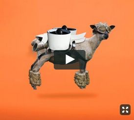
Yes, it’s another odd one, internally called JAWS, it was abandoned like a mutant, tossed like a hot potato into the hands of the poor soul who needed to resurrect this dying pig… or sheep.
Fortunately, I was not the poor soul, but Richard Falla. Pitying his sorry life dearly, I extended a finger — my pinky, to be precise — to assist his writhing body out of the the slings and arrows of outrageous fortune.
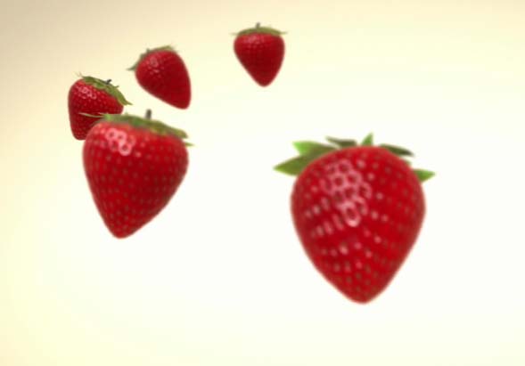
So I made racist kiwifruit drop from the sky and flags wave. Cool. In the meantime, Richard rescued the job from burning in hell.
This was another sub-contract from Australian vfx vendor. My contribution here was the extension of the trees at the beginning of the ad, which featured apples (real apples either weren’t on season at the time, or that they were apple trees to begin with). We bought some stock trees, I populated them with apples, shaded, lit, rendered in LightWave, and integrated them into the foreground and background areas of the matchmoved footage.
The trickiest bit, actually, was the Australian vfx company. They operated in Nuke, and required lensing data to be piped back to our renders. But while they knew their own process — which involved UV remapping, I hadn’t done it to other vendor’s specs before during post-production, but it turned out all right in the end, as it usually does.
This is a 3-part ad that ran on digital posters. The concept of the ad was simply to use the Japanese origami style of folding. Terry and I worked on this series, with him doing the first two (left and middle), and me doing the third. Terry consolidated all the shading in V-Ray, so that once the rig or animation was complete, they will all, more or less, render the same.
The rigging was, of course, the most complicated bit, along with cutting up the geometry to make it appear to fold. especially in the section I was working on, as it featured lots of round corners, pipe rails, etc. I found it difficult to translate a generator of the design the client wanted to fold like paper. In the end, I wonder if it looked more like a Transformer animation than folding paper.